sam@mkd-led.com
8613794642383


Color temperature is one of the first decisions that shapes how a space feels, how materials look, and how comfortable people remain under artificial light. In LED specification, color temperature is measured in Kelvin and usually falls within a practical white-light range from about 2200K to 6500K. ANSI C78.377 is widely used to communicate white LED color appearance in general lighting, which is why matching the target Kelvin range to the project is more than a styling choice. It is also a specification decision that affects consistency across fixtures and batches.
For interior projects, the basic rule is simple. Lower Kelvin values create a warmer and softer impression, while higher Kelvin values look cooler and visually sharper. Industry guidance commonly places warm white at about 2700K to 3000K, neutral white around 3500K to 4100K, and cooler white above that range. Warm tones usually support relaxation and hospitality ambience, while neutral and cooler tones are often chosen where clarity, concentration, and clean visual definition matter more.
That is why color temperature lighting should never be selected by trend alone. The right choice depends on the function of the room, the surface materials, the fixture form, and the emotional result the space is expected to deliver. A hotel lounge, a dining room, a reading corner, and a retail display can all use decorative luminaires, but the same Kelvin setting will not serve all of them equally well. Good specification begins with people, activity, and atmosphere first, then moves to lamp style and output.
When a project uses 2700K to 3000K, the light tends to feel softer, calmer, and more intimate. This range is commonly associated with warm white lighting and is often used where comfort is part of the experience. Wood finishes usually appear richer, fabric textures feel softer, and decorative fixtures gain more visual warmth. In residential interiors, boutique hospitality spaces, and dining settings, this range often helps the environment feel more relaxed rather than overly technical.
Around 3500K to 4000K, the atmosphere becomes more balanced. This is where many designers place neutral lighting because it sits between softness and clarity. It does not push the space too yellow, but it also avoids the harder visual impression that can come with very cool white light. Offices, reception areas, multipurpose rooms, and many modern commercial interiors often benefit from this range because it supports visibility while keeping the space comfortable for longer periods.
At 5000K and above, the environment appears brighter, cleaner, and more clinical. This can be useful in utility-focused settings, but it is not always ideal for decorative interiors. Cool light can flatten warm finishes, reduce perceived softness, and make some spaces feel less welcoming. For decorative indoor fixtures, many buyers therefore prefer the middle ranges unless the project specifically demands a crisp daylight effect.
The fastest lighting color temperature guide is to start from use scenario instead of fixture category.
| Space Type | Common Color Temperature | Visual Effect | Recommended Direction |
|---|---|---|---|
| Dining room | 2700K to 3000K | Warm, inviting, relaxed | Best for decorative pendants above tables |
| Hotel guest room | 2700K to 3000K | Soft, restful, premium | Good for layered ambient lighting |
| Living area | 2700K to 3000K | Comfortable and residential | Helps create a calm mood |
| Office lounge | 3000K to 4000K | Balanced and modern | Keeps comfort with adequate clarity |
| Reception area | 3000K to 4000K | Clean but welcoming | Suitable for mixed decorative and task needs |
| Retail display | 3000K to 4000K | Defined and focused | Depends on product color and finish |
| Work zone | 4000K and above | Bright and functional | Better where concentration is the priority |
The table above is not a rigid rule, but it reflects how designers typically balance comfort with visual performance based on ANSI-aligned CCT practice and common LED application guidance.
Many buyers ask how to choose LED color temperature when the fixture itself looks attractive in product photos. The safer method is to review five factors together.
Every space communicates a feeling before anyone studies the fixture details. Restaurants, guest rooms, and decorative corners usually need warmth. Shared living and reception areas often need balance. Work-focused spaces need more visual alertness. Picking CCT before defining the room mood often leads to a mismatch between lamp design and final atmosphere.
Color temperature changes how finishes are perceived. Warm wood, brass-tone details, soft fabric shades, and beige stone usually read more naturally under warmer light. Black metal, glass, white walls, and minimalist interiors can often carry 3000K to 4000K more easily. A lighting sample that looks excellent in a white showroom can feel very different once installed over timber, marble, or textured paint.
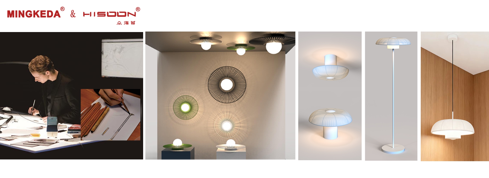
Decorative fixtures are not only light sources. They are visual objects. MINGKEDA’s portfolio covers multiple indoor categories including Table Lamps, Floor Lamps, Wall Lamps, Ceiling Lamps, camping lamps, ambient products, and Pendant Lights, with the pendant category alone showing a broad product range on the site. That category depth matters because color temperature decisions often need to be coordinated across a full family of fixtures rather than a single SKU.
Color temperature is also a supply chain issue. Buyers do not only need the right Kelvin number on paper. They need repeatability from pilot sample to mass production. ANSI C78.377 exists precisely because white color appearance needs to be communicated in a standardized way for solid-state lighting products. When projects involve repeat orders or series development, tight control over chromatic consistency becomes critical.
Even a well-designed fixture can feel wrong when used at the wrong time of day. Warm settings are often more comfortable in evening environments, while neutral settings are easier for daytime mixed-use interiors. This is one reason why the same pendant design may be specified at 3000K for a dining project and at 4000K for a commercial public area.
Choosing Kelvin is easy in theory and harder in real production. Buyers often face questions beyond a simple 3000K or 4000K label. Will the light feel too yellow under a fabric shade. Will metal finishes still look premium. Can the same collection maintain visual harmony across pendant, wall, and table versions. Can the supplier support custom development while keeping CCT stable in volume orders.
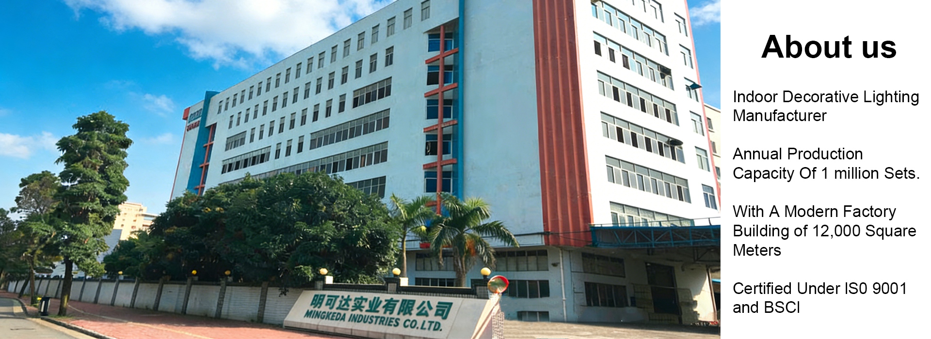
This is where manufacturer capability becomes important. MINGKEDA presents itself as a lighting manufacturer with broad indoor category coverage, OEM and ODM support, and more than 41 years of design and production experience highlighted across its site content. That structure is valuable because color temperature selection is connected to housing material, shade structure, light distribution, and final application scene. A supplier that handles product development and manufacturing in one system can solve these factors earlier in the process instead of leaving them to trial and error.
For decorative indoor programs, this integrated approach reduces risk in three ways:
It helps align lamp appearance with target ambience instead of treating Kelvin as an isolated technical number.
It improves communication during sampling, especially when multiple fixtures must work as one collection.
It supports better continuity between design approval and repeat production.
For most decorative residential and hospitality-oriented interiors, 2700K to 3000K remains the most reliable starting point. It supports comfort, gives surfaces a warmer character, and works naturally with many pendant and ambient forms. For contemporary mixed-use interiors, 3000K to 4000K is often a stronger choice because it balances softness and clarity. For highly functional zones, higher Kelvin values may still be appropriate, but they should be used with care when visual warmth is part of the brand or interior concept.
A simple decision model can help:
| Project Goal | Better Starting Range |
|---|---|
| Relaxed and intimate atmosphere | 2700K to 3000K |
| Balanced decorative and practical use | 3000K to 4000K |
| Crisp visibility and task emphasis | 4000K and above |
The best answer to how to choose LED color temperature is not a universal number. It is the Kelvin range that supports the room mood, fits the material palette, and stays consistent through production. Strong lighting design comes from combining visual intention with manufacturing control. With wide indoor product coverage, visible customization capability, and long production experience shown across its website, MINGKEDA is well positioned to help buyers move from inspiration to reliable specification with fewer mistakes and better atmosphere outcomes.